Reminder: Web Accessibility Compliance Law in effect
Learn how to meet accessibility standardsAcademic program widget
About
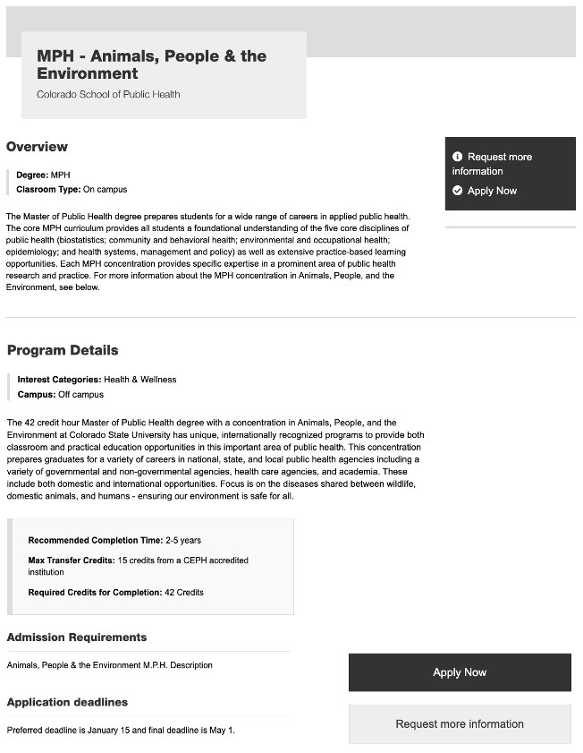
The Academic Program widget consistently displays and showcases all academic programs across the university. Academic program data was submitted by schools and colleges and we have imported it into Sitefinity for use. It is in its first iteration and the widget offers a simple list template, a card template, and a detailed template.
 NOTE: This is a reusable content type widget, which means it is dependent
upon content you've first created as a content type from the dashboard menu.
Design
How to
Create academic program content
The Academic Program widget is a reusable content type. This means that all of the programs displayed with this widget have to first be created in the "Content" area on your dashboard. The follow steps will walk you through creating an academic
program.
- From your Sitefinity dashboard, click the "Content" tab located at the top of your webpage and select Academic Programs.
- Click the option to create an academic program.
- Fill out the first section. Be sure that your article title and degree program title are the exact same. Create a new degree program title, if there isn't one already created. Everything in this section is required with the exception of Program Page Link (external and internal) and Department.
- Program highlights is the next section and this feature will give you a grey facts and figures bar in the detail view. To use this feature fill in up to three highlights.
- Courses gives you the ability to display sample courses. You can add up to 4 course examples.
- The default header is Sample Courses. Fill in the customer header to change it.
- Enter in the additional course information.
- Repeat as necessary up to 4 times.
- Next, fill out the Program Details information. (Required fields: Recommended completion time and Program description)
- Program Contact is an associated reusable content item. This is so it can be used for multiple programs with the same contact. Click the plus button (+) to select the contact. If the contact does not yet exist, create one with the instructions below.
- To create a contact, first complete the required program information and save as a draft.
- Then, go to the Content area of the dashboard and click Contact Groups.
- Select the option to Create a Contact Group, give it a title that best describes your unit or department and/or program and click publish. (The group only needs to be created once.)
- Once the group is created, click Contacts under that group on the next screen.
- Click Create a Contact, fill in the contact information, and publish.
- Now, go back to your academic program and add your new contact under Program Contact.
- Choose your contact and Publish.
- Areas of Concentration are also reusable content items so they can be used for multiple programs with the same concentration.
- To create a requirement, click the plus button (+) under areas of concentration. Choose the option to create a new item, fill out the information and Publish.
- You also can search for existing concentrations, as not to have duplicates.
- Add Related Links to your program to show clickable links in the detail view of the widget.
- Add Related documents to be listed a well. Simply give the document a title, select the plus button (+) and choose a file to upload or from your library.
- Fill out the admissions requirements information and other admissions details in the Admissions Information section.
- Admission requirements are also reusable content items and required. This is so they can be used for multiple programs with the same requirements.
- To create a requirement, select the plus button (+) under admissions requirements. Choose the option to create a new item, fill out the information and Publish.
- You also can search for existing requirements, as not to have duplicates.
- Admission requirements are also reusable content items and required. This is so they can be used for multiple programs with the same requirements.
- Add at least one clickable button under the Call to action buttons section.
- Related News and Media give you the ability to add up to three related articles from your news room and a featured image to be displayed in the detailed view.
- To add articles, click the plus button (+) under News, and choose your article.
- To add an image, click the plus button (+) under Featured Image for Detail Tempalte and choose your image from the library or upload a new image. (max. height of this image is 300px)
- Under Tagging, add tags and categories, if you'd like.
- For more information about tagging and categories, please see this page.
- Associated keywords are required. Type in your own or select from existing keywords.
- Lastly, add in your Degree Program Finder key.
- Publish.
Use the widget
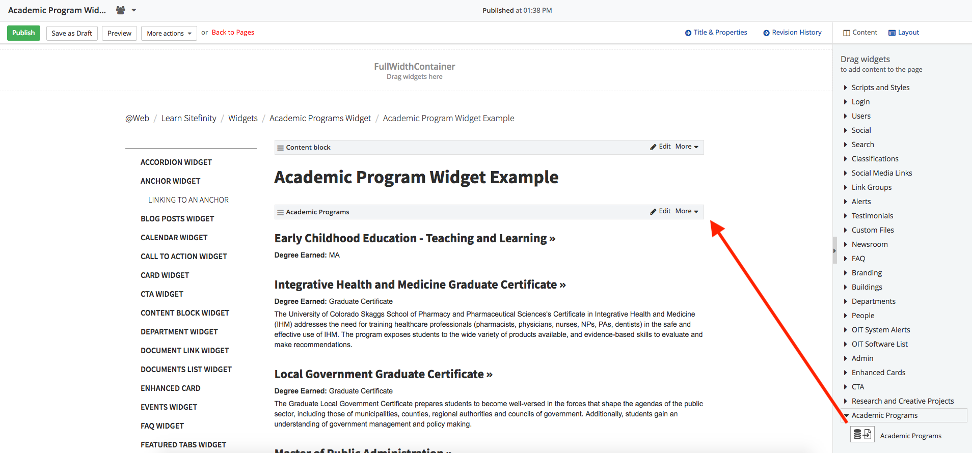
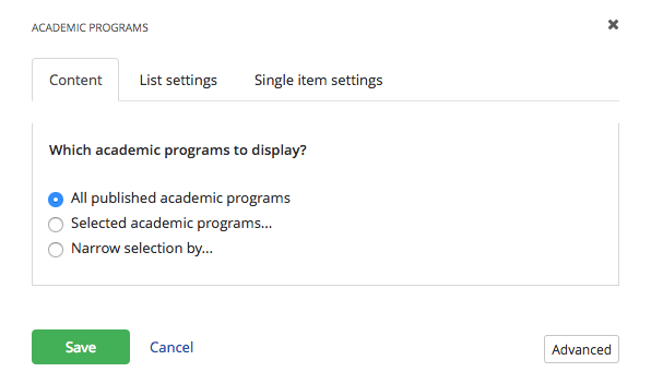
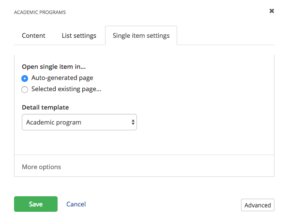
Choose Edit to select the program you wish to display under the Content tab.
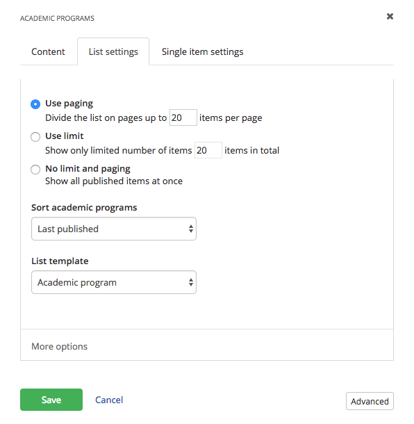
Search and filtering
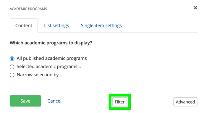
The academic programs widget has the option to enable text search and filtering at the top of the widget for a more simplified user experience.
- Select "Edit" on the widget and then select the Filter button.
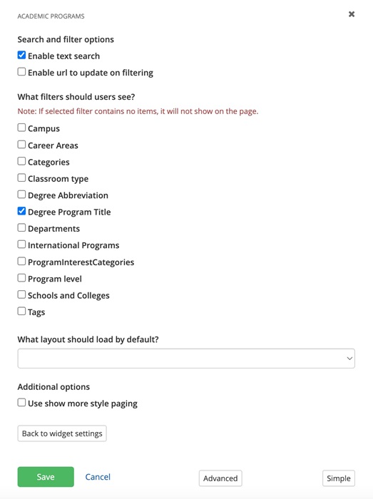
- To enable the search box, select "Enable text search".
- To enable filtering, select the filters for users to see.
- To enable a "Show more" button at the bottom of the widget (instead of numbered pages), select "Use show more style paging".
- Save your selections.
Additional information
Academic Program Finder
The Academic Program Finder (APF) web module is a tool, separate from the Sitefinity Academic program widget, which enables students to discover degree and certificate programs offered by CU Denver.
Students can explore program descriptions, estimated credits, and related programs and occupations. Visit the following page to see the APF web module in action: https://www.ucdenver.edu/academics/degrees-programs/explore-programs
If you would like to add a CU Denver or CU Anschutz program to the APF results, please submit a Cherwell ticket. Program descriptions and related information will need to follow the Academic Program Finder style guidelines: Content Style Guide for Academic Program Finder.
Featured Image Size
The featured image is set at a max height of 300px, full width. Research has shown that most users will only scroll 50% down the page; by keeping the image small, we can give users a visual cue that there is more information below the image. To further improve the user experience, we recommend selecting images that add value to the page content.
