Reminder: Web Accessibility Compliance Law in effect
Learn how to meet accessibility standardsAccessible Headers
Benefits of Headings
Headings are an important part of a page, and when used appropriately, help users get a sense of what kind of information is on a page and its structure. Visually, headings are usually larger than text surrounding it, making it more apparent to users. Users can quickly scan a header and determine whether or not that section of the page will consist of information important to them. Larger text also helps users with cognitive disabilities or poor eyesight to find headings much faster. Although headings are styled differently than text surrounding it, headings should not be used solely for style purposes.
Headings are especially helpful to third-party tools such as screen readers. Screen reader users can navigate a page via headings on a page, listen to a list of all headings on a page, and select a specific header for the screen reader to begin reading at that point of the page; skipping content they deem less important and making their experience faster. In 2017, WebAIM surveyed preferences of screen reader users and found that almost 70% of these users preferred to find information by navigating headings. This finding further supports the idea that headings are important to organizing a page and can be easily done to meet accessibility guidelines.
Appropriate use of Headings
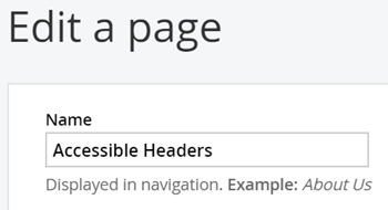
Headings are ranked from H1 through H6, H1 being the most important and H6 being the least important. Headings should be used hierarchically and ranks should not be skipped. This means H1 should be reserved for the title of the page and only one should be present on a page. You should try to keep the H1 as similar as possible or exact to the title of the document. The title of the document is the title shown on the browser tab and on the top navigation bar. You can change the title through the "Title & Properties" setting in Sitefinity.
Each new section on a page should begin with H2, sub-sections within H2's should begin with H3, and so forth. Unless you have a long and complex page set up, H5 and H6 should rarely be used. It is also acceptable to end a section with an H3 and begin a new section with H2.
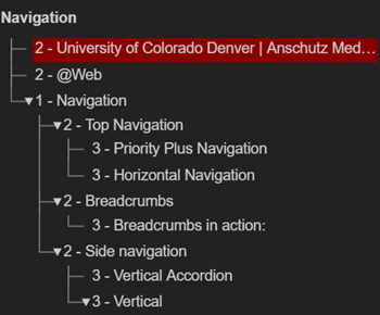
Although it is not visually apparent, when you use header ranks hierarchically, it appropriately nests the headings for screen readers and browser plug-ins. This ensures that screen reader users are aware of how sections of a page relate to one another should H3-H6 headings be present.
Example:
Heading Styles
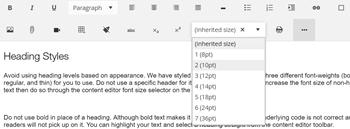
Avoid using heading levels based on appearance. We have styled headings H1-H3 to have three different font-weights (bold, regular, and thin) for you to use. Do not use a specific header for its font size, if you want to increase the font size of non-heading text then do so through the content editor font size selector on the toolbar.
Use Headers to Organize Your Content
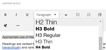
It is very important that you do not use bold in place of a heading. If it is functioning like a header then turn it into an appropriately marked header. Although bold text makes it look like a heading, the underlying code is not correct and screen readers will not pick up on it. This can make navigating the page frustrating and confusing for screen reader users. You can highlight your text and select a heading straight from the content editor toolbar.

Heading Styles
Avoid using heading levels based on appearance. We have styled headings H1-H3 to have three different font-weights (bold, regular, and thin) for you to use. Do not use a specific header for its font size, if you want to increase the font size of non-heading text then do so through the content editor font size selector on the toolbar.

Do not use bold in place of a heading. Although bold text makes it look like a heading, the underlying code is not correct and screen readers will not pick up on it. You can highlight your text and select a heading straight from the content editor toolbar.
