Reminder: Web Accessibility Compliance Law in effect
Learn how to meet accessibility standardsAccessible Images
Importance of Accessible Images
For visual users, images can enhance content surrounding it and add more meaning to the content. When placing images on your page, it is important for editors, developers, and designers to keep screen reader users in mind. Many screen reader users include users who are blind, have low vision, or have cognitive disabilities. Images should always provide an effective "alternative text" for images. When a screen reader encounters an image the alt text is read out to them.
Not only do screen readers rely on the alt text to make sense of an image, but there may users who prefer to disable images on the web. In this case the alt text will display in place of the image. These users may be those who have slow internet connections or cognitive disabilities that cause them to prefer to disable images.
Aside from alt text, optimizing images and making sure your images use generous color contrast ratios is also important. Users with low vision may zoom into a page in order to make better sense of the content and image, if an image is not properly optimized then the image may become pixelated when a user zooms into the page. If your image shows text or important content in it (e.g. graph), make sure the color contrast ratio is appropriate so that color blind users can make out the varying colors or the possible importance of the colors.
Alternative Text
Images and non-text content should always include an alternative text, or simply known as "alt text". The alt text presents a text equivalent of the image or non-text content. Therefore, alt text should properly present the content and function of an image. Alt text is displayed in the HTML code for the image. Screen readers read the alt text aloud to the user and the alt text will display instead of the image if a user prefers to disable images or the image fails to load.
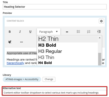
Alt text can be added to an image once an image has been uploaded. After uploading an image, edit the image properties and fill out the "Alternative text" field.

The "Title" field is not the same as the alternative text. The title appears when hovering over an image.
Image and Alt Text Guidelines
Making sure your alt text is appropriate can be tough depending on what the image is displaying and the content that ties in with the image. Since alt text should be conveying the content and function of an image, writing effective alt text can be challenging. A few best practices to follow are:
- Alt text should be succinct and not too long (less than 250 character preferred)
- Avoid using phrases such as "photo/image/graphic of..." as this is redundant, screen readers know it is an image and users who disable images also know it is an image. If image is a logo it is acceptable to say "logo of..." or simply state the company/organization logo belongs to
- Do not expect the "Title" to suffice without filling in an appropriate alt text. The title field will never reach keyboard only users or mobile users
- Image links should be treated as links, therefore; alt text should describe the purpose or destination of the link and not the image
- Decorative images such as icons, dividers, etc can should have blank or empty alt text. Screen readers will disregard images with empty alt text
- Complex images such as graphs, figures, or charts should provide additional content nearby that describes the image adequately. Alt text should not be used to describe such a complex image as it can be too long, but it should direct user to content that explains the image in detail (e.g. "Graph showing increase in student enrollment, additional information given below image)
- If possible, images of tables should be converted to actual table with text
- Posters or flyers must provide same information in nearby text. Alt text can direct user to text equivalent
- Keep color contrast in mind when choosing images, especially if color is important in order to understand the image (like graphs)
For more information on alt text and how to write effective alt text visit WebAIM: Alternative Text
Images of Text
Images of text is highly discouraged, especially if content within the image is important for users to have access to. If image has multiple lines of text then it is much more appropriate for the text to be elsewhere on the page as actual content. If the image only has a small amount of text like a short quote, then the text should be mimicked in the alt text. If your text is very long then do not replicate it in the alt text field. That is not an appropriate use of the alt text field.
If you do use images of text then it is important that you follow these guidelines:
- The font size of the text in an image should be large, the larger the better. This will help mitigate pixelation when image is magnified.
- Color contrast ratios becomes a very important issue when it comes to text in images. Make sure that contrast ratio is at least 4:5:1.
Complex Images
Complex images include images of maps, tables, graphs, infographics, illustrations, etc. These type of images are a lot harder to describe to users and alt text is not sufficient in this case to convey the importance of the image. Additional information should be included next to the image and alt text should direct users to that information.