Alert: The Plaza Building will remain closed through Jan. 20, 2025.
The Plaza Building will remain closed through Jan. 20, 2025. The Health Center is operating in a modified capacity. Call 303-615-9999 for appointment information during operating hours. Reminder, the Health Center is closed for the winter break Dec. 24 - Jan. 1.
Learn More
Reminder: Web Accessibility Compliance Law in effect
The new Colorado accessibility law, HB21-1110, affects university websites and went into effect July 1, 2024. This means that university website owners/content managers must ensure your website content meets the minimum web accessibility standards.
Learn how to meet accessibility standardsWebsite Navigation
Website navigation is one of the most important aspects of User Experience. It facilitates wayfinding and helps site visitors make decisions. Good navigation is crucial to your website’s success. Navigation is like a table of contents for your website. It can generally live in a few different place on a website: at the top; in the breadcrumbs,
or in a column on either side.
Navigation is helpful to your audience because it offers the user a list of all the sections within a website and can assist them with finding information that is relevant to them. You can customize these navigation items to suite the need of your site or audience.
If you want your navigation sections to be, for example, Services, Classes and About, start by creating those pages. Items in your navigation will appear as you create and publish pages on your website. If you need to reorganize the navigation, either on a working page or on the Pages page, simply drag and drop to move the pages around.
Navigation properties
Navigation properties are found under Title & properties in the Page Navigation section. Navigation should always be setup on the homepage and all top level pages. Child pages will automatically inherit the same properties so there is no reason to break the inheritance for these pages.
There are two ways to manage navigation for individual pages.
Creating a page
When creating a new page you will have the option to setup the navigation. The option to "Show in navigation" is automatically checked for all pages. If a page should not be included in the navigation for the site, simply uncheck this option.
Also, you have the option to select link indicators to show both external and password protected pages in the navigation. Please note that the password protected icon overrides external icons if the are both selected.
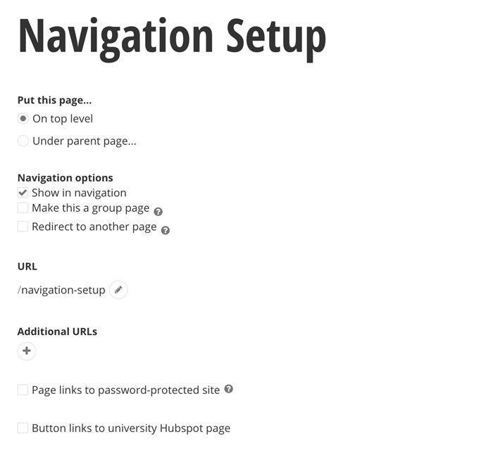
Change an existing page
At any given time, navigation settings can be changed for an existing page by going to Title & properties located in the top right corner of a page in edit mode.
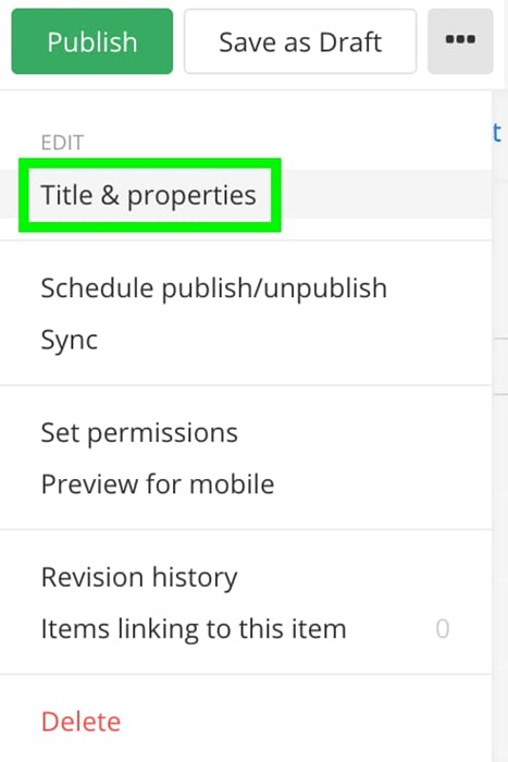
Regardless of how the navigation properties are accessed, the options will be the same. You can customize the navigation under Page Navigation in Title & properties.
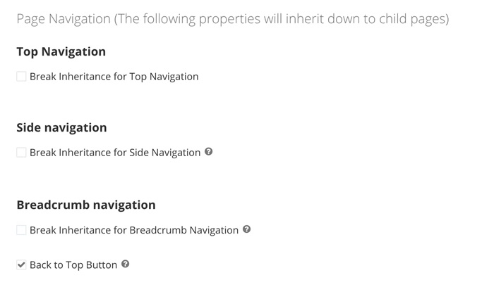
Once you break the inheritance, you will see the navigation options.
Top Navigation
The top navigation is located at the top of the page and is managed in "Title & properties". This is the main menu and should display all the top-level pages on a site. Top navigation should remain the same on every page throughout your website. There are three templates for top navigation. Site builders have the choice of using whichever template they want and it should be consistent throughout the entire site.
Best Practices
The horizontal navigation is essential for way-finding. Use this menu across all pages of your site and keep it consistent. Changing the main menu from page to page within the same site will result in a confusing user experience.
For a clear, easy-to-digest menu, reduce the number of navigation options and keep the navigation as flat as possible: use 7 or fewer top level navigation items, and include only 1 level of drop-downs. Figure out what users are looking for, and use category labels that are familiar and relevant. Menus are not the place to use made-up words and internal jargon. Stick to terminology that clearly describes your content and features.
We recommend that you implement either all group pages or all standard pages in your top navigation menu to create a consistent user experience.
Top Navigation Templates
Priority Plus
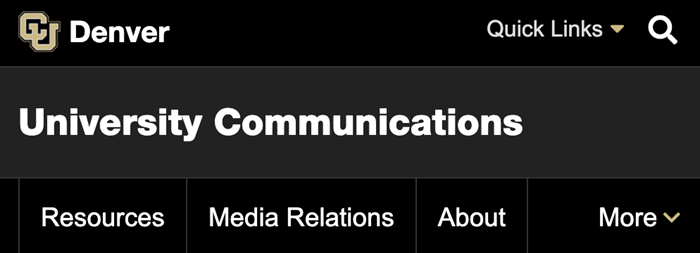
Priority plus is the recommended template because of its mobile first approach. When users are on mobile devices they still see some of the top navigation items. The items that do not fit are moved to a drop-down menu labeled “More”. This allows your audience to feel like they still have full access to the site regardless of device. There is no drop-down menu option for child pages.

Horizontal Navigation
Horizontal is the more traditional option. This allows your audience to see a drop-down menu of associated child pages. The menu allows multiple levels of fly outs and links to pages at the top of each fly out area. This option displays a traditional hamburger menu in mobile. We have improved the mobile experience by implementing a static menu under the hamburger icon that allows site visitors to view and hide child pages using a plus (+) and minus (-) option.

Enhanced Navigation
Enhanced is the best of both previous options. This allows your audience to see a drop-down menu of associated child pages. The menu allows multiple levels of fly out and links to pages at the top of each fly out area. When navigation overflows in desktop, site visitors will still see some of the top navigation items. The items that do not fit on the screen are move to a drop-down menu labeled “More”. The hamburger menu is displayed in mobile.

Mobile view of top navigation
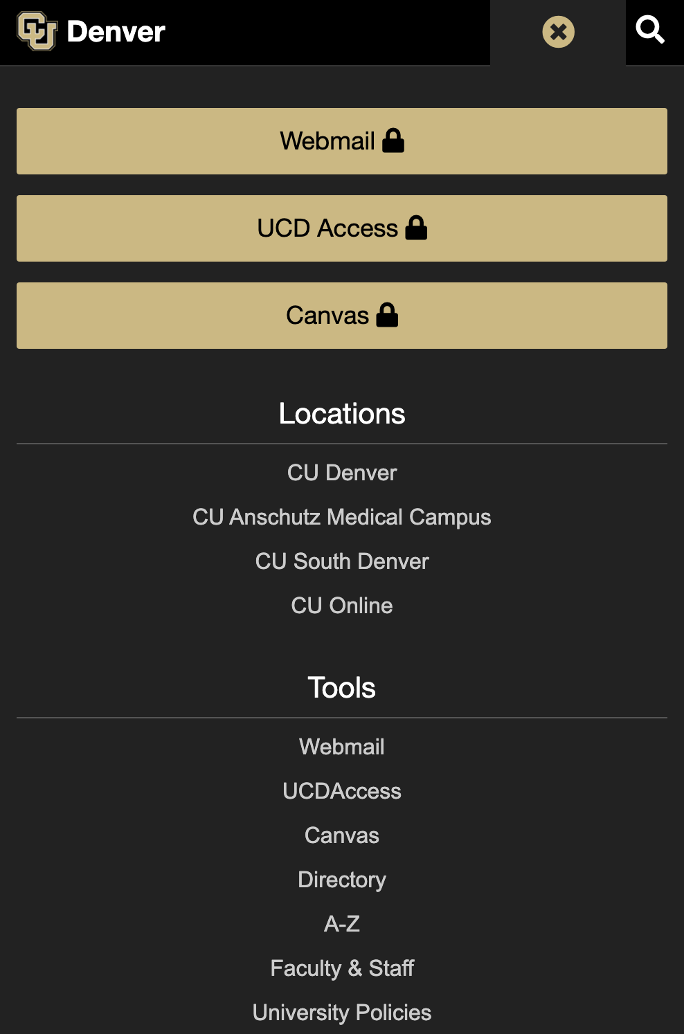
Priority plus
In mobile, the big three links (usually Webmail, UCDAccess and Canvas) nest under Quicklinks. The top navigation is still partially displayed; any tabs that do not fit on the screen are nested under the more dropdown menu. The search icon is still present.
Collapsed view
Expanded view
Horizontal and Enhanced
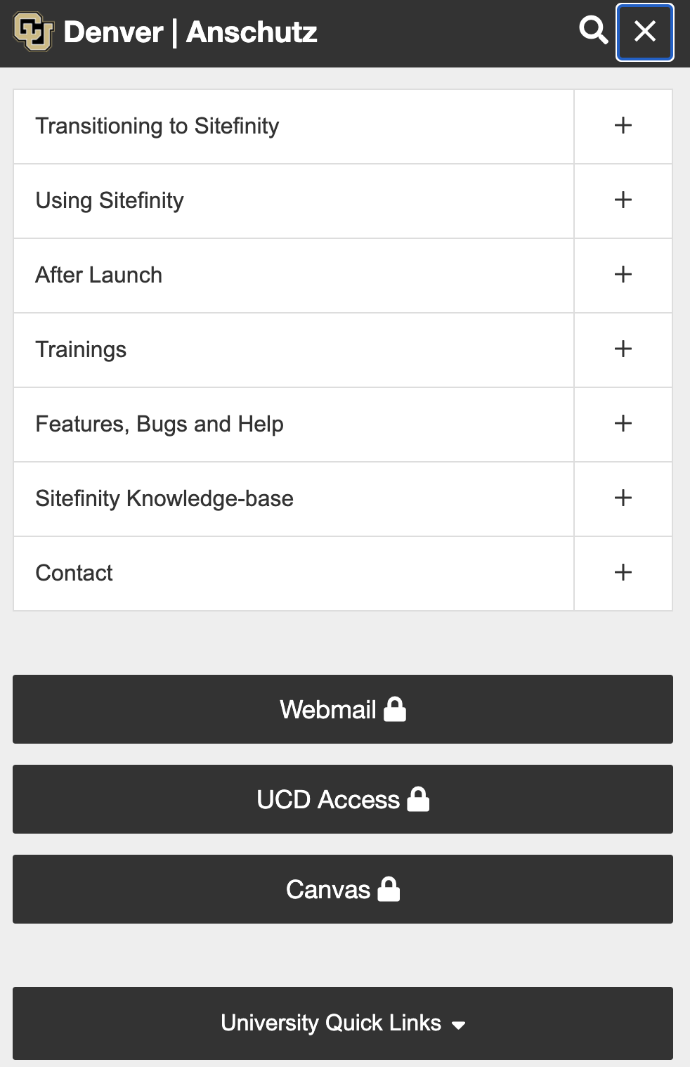
These two navigation options behave the same way in mobile. Quicklinks, the big three links and the top navigation for the website nest under a hamburger menu. The search icon is still present.
Collapsed view

Expanded view
Top navigation setup
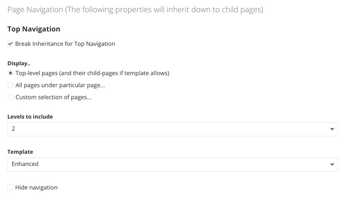
- On all top level pages, click “Break inheritance”. The default selection is “Top level pages (and child pages if template allows); this is our recommendation.
- Choose the level of pages you would like to show; our recommendation is 2.
- Select your navigation template; our recommendation is “Enhanced”.
Side navigation
The side navigation is usually on the left hand side of a page, under the area where you might see the breadcrumbs. It will allow users to see other associated child pages, parent pages, etc. under a specific page based on settings selected. There are
two views available for side navigation as described below. These templates can be changed in the "Title and Properties" of a page.
Best practices
The side menu helps users navigate within a sub-section of your site. This menu should not copy the horizontal menu; rather, it should include pages that are not accessible from the main navigation. You should only use this menu on pages of a subsection not navigable from the main menu.
For example, if your sitemap looks like this:
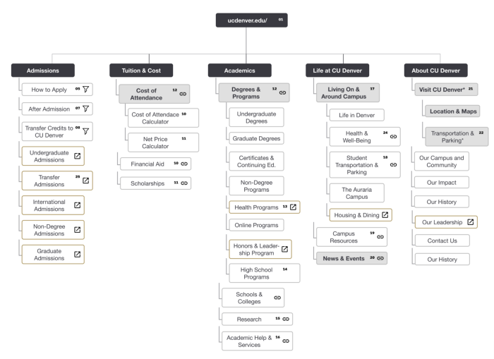
the side navigation should be used for navigating through the following sections:“Cost of Attendance”, “Degrees & Programs”, “Living Around Campus”, and “Visit CU Denver”, since none of the pages within these sections will be visible and clickable from the main navigation.
Side navigation templates
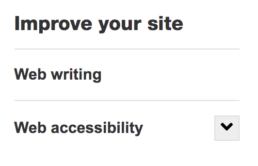
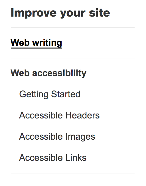
There are two templates available for side navigation: vertical and accordion vertical.
Vertical accordion
Shows pages as defined in the settings and does not automatically show the child pages. This option allows site visitors to expand child pages based of settings by the site builder.
Vertical
Shows pages as defined in the settings and automatically shows the child pages. This option allows site visitors to see parent and child pages based of settings by the site builder.
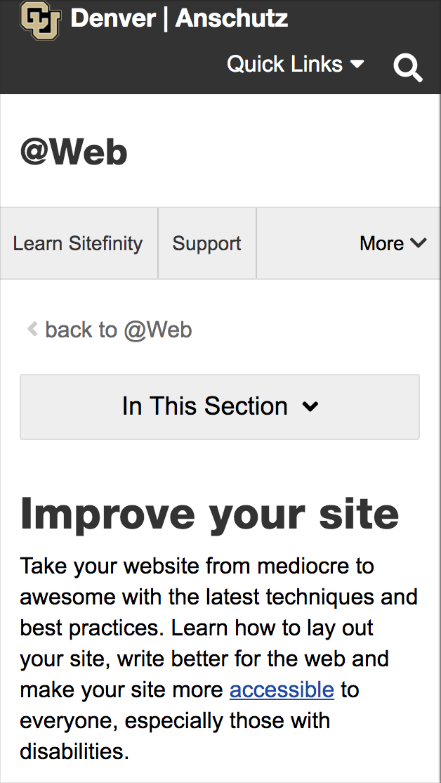
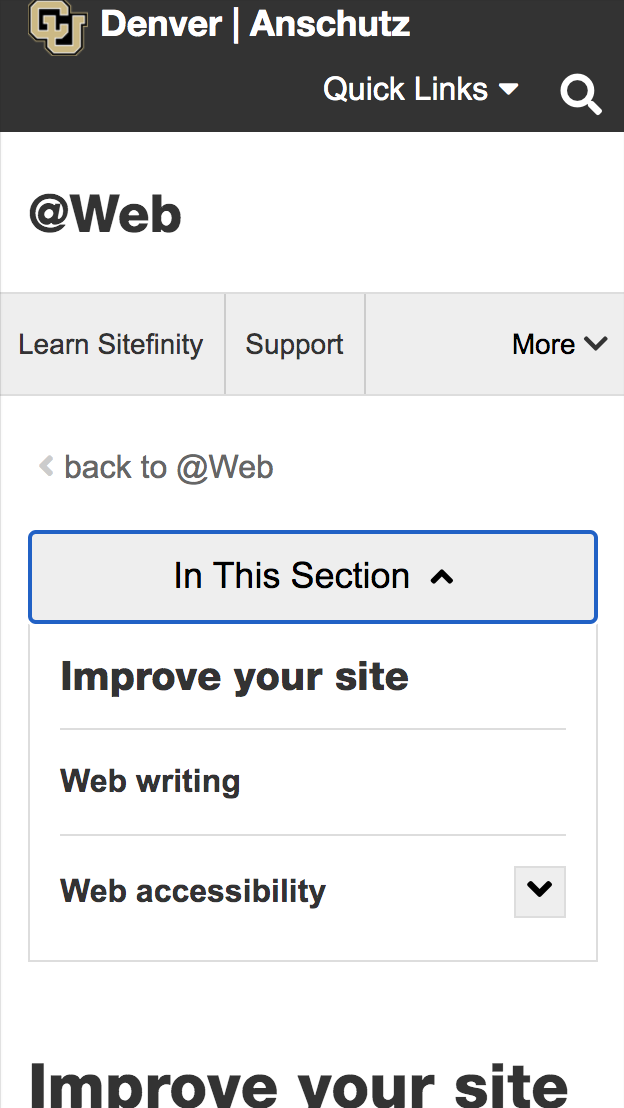
Mobile view of side navigation
Collapsed View
Expanded View
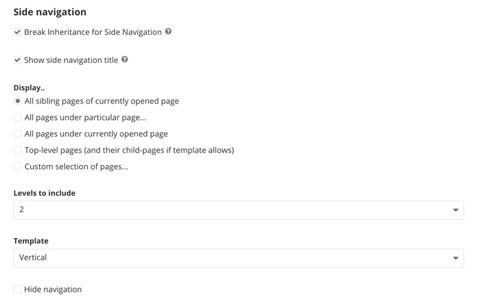
Side navigation setup
Side navigation has option to display a header above the navigation items; you have to opt in to show it. The header, by default, is the parent page of the selection of pages. If the pages displayed are top level pages, they will not have a title as they do not have a parent page.
To setup side navigation, do the following:
- Click Break inheritance.
- Check the box if you would like headers just above the side navigation.
- If a user selects “top-level pages”:
- The side navigation is a replication of the main horizontal navigation
- The side navigation header never shows because it would be the site title
- If a user selects “all pages under the particular page”:
- The side navigation will show all pages that live under that selected page
- The side navigation header should be the name of the page that is selected
- If a user selects “all pages under the currently opened page”:
- The side navigation will show all pages that live under that selected page
- The side navigation header should be the name of the page that is selected
- If a user selects “all sibling pages of currently opened page”:
- The side navigation will show all pages that are siblings (meaning they are the same page level in the hierarchy)
- The side navigation header should be the name of the parent page of all those siblings
- If a user selects “custom selection of pages”:
- The side navigation will show the pages that are selected
- The side navigation header will be the custom entry field
- If a user selects “top-level pages”:
- On all top level pages, click “Break inheritance”. The default selection is “All sibling pages of the currently opened page”; this is our recommendation.
- Choose the level of pages you would like to show; our recommendation is 2.
- Select your navigation template; our recommendation is to use “Vertical” if you only have a few child pages and “Accordion vertical” if you have a lot of child pages.
Breadcrumbs
A breadcrumb refers to the "trail" of pages a user has selected to reach their current location on any website. In Sitefinity, a breadcrumb always sits at the top of the page and is flush left.
For example, they might start on the Homepage, then click Services, then Programs, then Contact. The breadcrumb would look like this: Home > Services > Programs > Contact.
Best Practices
Similarly to side navigation, breadcrumbs are intended to supplement the main navigation bar that stretches across the top of every page. Breadcrumbs should be used on sections of the site that are not navigable from the main horizontal navigation. For sites with flat hierarchies with only 1 or 2 levels of categories, a breadcrumb isn’t needed as a way-finding device.
Breadcrumbs are especially useful in mobile in helping users orient themselves when the main menu and the side navigation are hidden/collapsed.
You can leave breadcrumbs off the homepage due to redundancy.
Breadcrumbs Template
Breadcrumb
There is only one template.
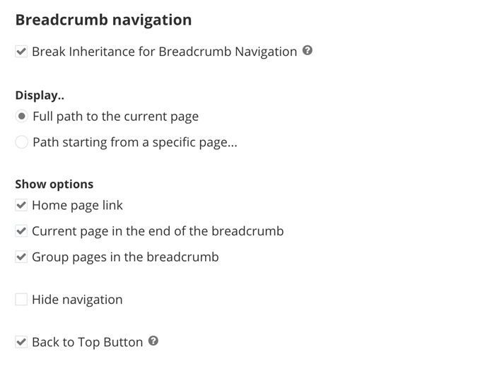
Breadcrumb navigation setup
- On all top level pages, click “Break inheritance”. The default selection is “Full path to the current page”; this is our recommendation.
- Under Show options, our recommendation is to include the home page link and the current page in the end of the breadcrumb.
- Note: builders usually leave this off of the homepage due to redundancy. Check the box to hide this in your homepage properties.
 Navigation menus can be page levels deep. Site owners have the option to select how many levels you would like your audiences to see based on the needs of your site.