Reminder: Web Accessibility Compliance Law in effect
Learn how to meet accessibility standardsWebsite Design
Your website design is made up using a few factors: site theme, page templates and widgets. Paired with your website theme, you will use a combination of page layout templates and widgets to customize your design.
Site theme
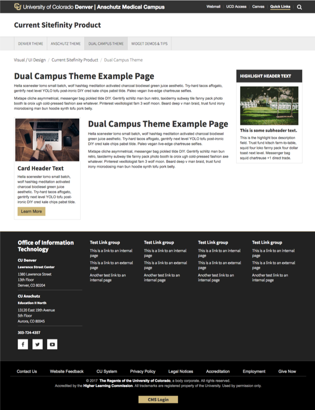
This includes the visual theme, color scheme, header and footer for your website. There are themes for each campus: CU Denver, CU Anschutz and dual-campus units. Themes are selected by site owners before build and are based off a units primary location and the audience served. For example, it you are primarily located at CU Anschutz and serve CU Anschutz faculty, staff, and students, you would use the CU Anschutz theme.
Click the images below to view the theme examples:
Page templates
A page template provides a general outline of where your content will display on your page. There are five templates per theme: CU Denver, CU Anschutz and dual-campus units. Each one presents a suggested layout with a combination of columns for different types of content. By default, these layouts are simple but you can combine grid widgets within your layout options to further customize your design.
Below are the template options available to you. The colored content areas give you an idea of where your content displays on desktop and how it transitions to a mobile view.
Click on any of the templates below to see a sample layout page.
Widgets
Widgets are tools that let you organize and display your content. For example, if you would like to display an image you would use an image widget. You can drag and drop widgets right onto your page – no design or coding skills required!
To use a widget, you will have to first create a page or choose a page to work on. Once you click on a page to edit, choose a widget category – either Content or Layout in the upper right corner. Then drag a widget from the right column onto the page. Once you've dropped a widget on the page, choose Edit. Some widgets – like FAQ and events – have multiple display options.


